Well was approached by Disruption Labs in 2018 to collaborate on a project which saw the R&D company implement patented nanotechnology into the already booming CBD sector in the US and Europe. The Disruption Labs team, led by Matt Reid and Chris Barber wanted to create a brand that didn't fit in with the current "pop-culture" aesthetic of the industry. For one, their CBD is 100% THC free and secondly, they wanted to remove the stigma that cannabis still faces to this day, despite its fast paced legalisation across the globe and recognition as an alternative to traditional mass produced pharmaceuticals.
The aim was to create something that could be as much at home in a surfer's backpack as it would be being prescribed by a GP. What was produced was a clean, sleek, yet energetic brand that balances marketable vibrancy, as well as the feeling of data driven results and respectable self-medication.
Starting with the ever so humble nano-particle is where the journey started. How to create supporting graphics that could be linked into the logo, packaging and science of the product? Through much exploration, a system of graphics were developed around concentric and patterned circles or dots. This initial decision to honour the dot like nature of nano-particles can be seen through the entire brand, from the construct of the logo to the shape of the actual packaging that houses the CBD tincture dropper.
Here above you can see how the bespoke logotype was constructed using uniform circles to cut and carve out negative and positive space into the mark, balancing the loose residual dots that are left on the 'r' and 't'.
To keep the look of the brand sleek and almost "medical" in feeling, a simple, versatile type-system was needed. Bold, modern and youthful when it needs to be, but serious and legible at small sizes when it has to be. Avenir Next was a clear decision. No paired type or complication, just Avenir Next in Black, Heavy, Medium and Book.
With regards to colour, it was important to keep the brand serious at times as CBD, at this very moment, is mostly used to self-medicate for afflictions such as PTSD, anxiety, period pain etc. It was important to be able to use paired down combinations of colour to allow the science to speak, while the introduction of pattern work and more colour helped with creating marketing and promotional materials. Pantone 170c and 540c ("Reset salmon" and "Reset blue") was decided on as the final accent colours.
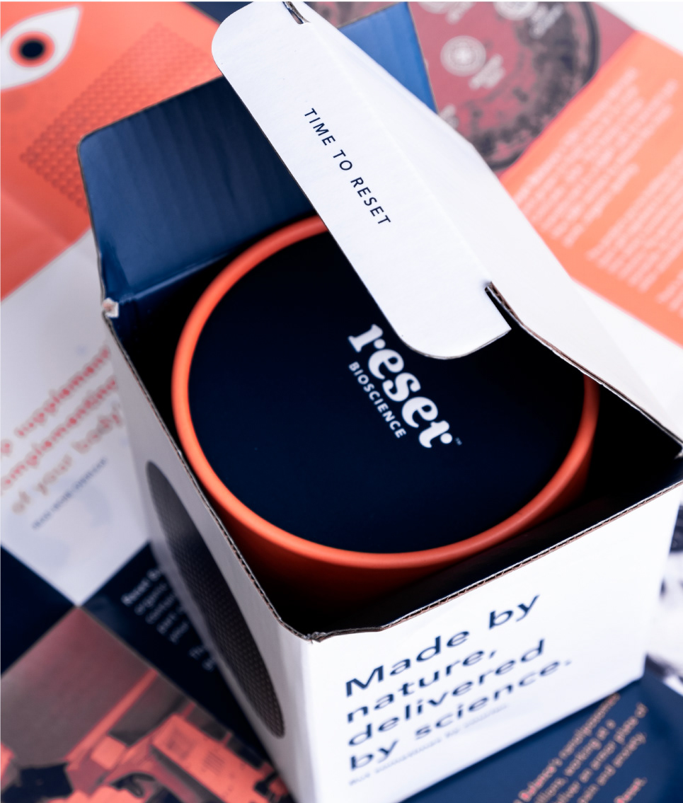
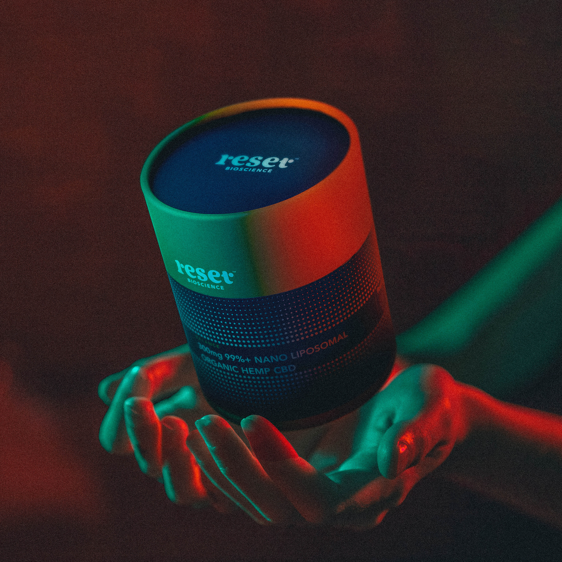
The first item of packaging that was developed is a custom box which is used as a Pioneer Pack. These packs have been sent out to thousands of KOLs, fitness personalities and as well-being enthusiasts that associate with the brand and it's culture.

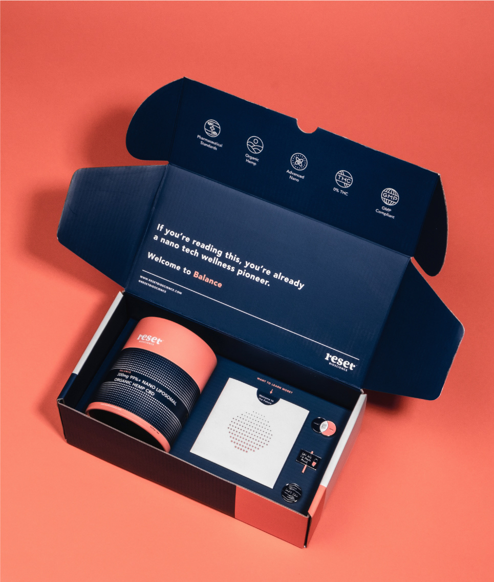
The custom designed pack includes a cardboard tube that encloses a dropper bottle, pipette, an instruction and research manual and enamel pins for all nanotech pioneer's to rep their new favourite brand.
The enamel pins were designed to communicate one of the brand's core USPs, It's the safest most effective pain killer on the market and in complete opposition to traditional mass produced pain killers.
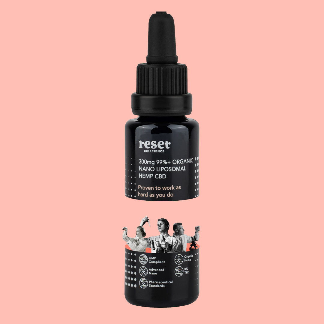
A set of iconography was developed as Reset needed to depict core functions of the product and its uses simply and effectively across many items at a range of sizes.
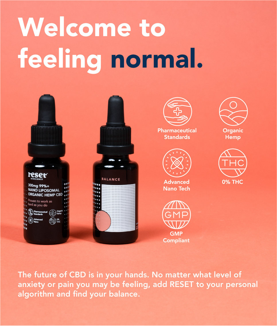

Above is a closer look at the bottle that is produced in California by Monvera, a pharmaceutical grade bottling plant. Labelling is UV printed across the extremely dark indigo glass. The glass appears black and is used to stop sunlight from affecting the contents of the bottle. Once again the design work is an ode to nano-encapsulation and CBDs ability to align your endocannabinoid system.
Photo by Gideon de Kock
Photo by Gideon de Kock
Aside from the Pioneer Pack, a single sale box needed to be designed for retail and online sales. The box needed to be robust enough to withstand courier services cross-country, but still look sleek enough to be consistent with the rest of the brand's visual identity.
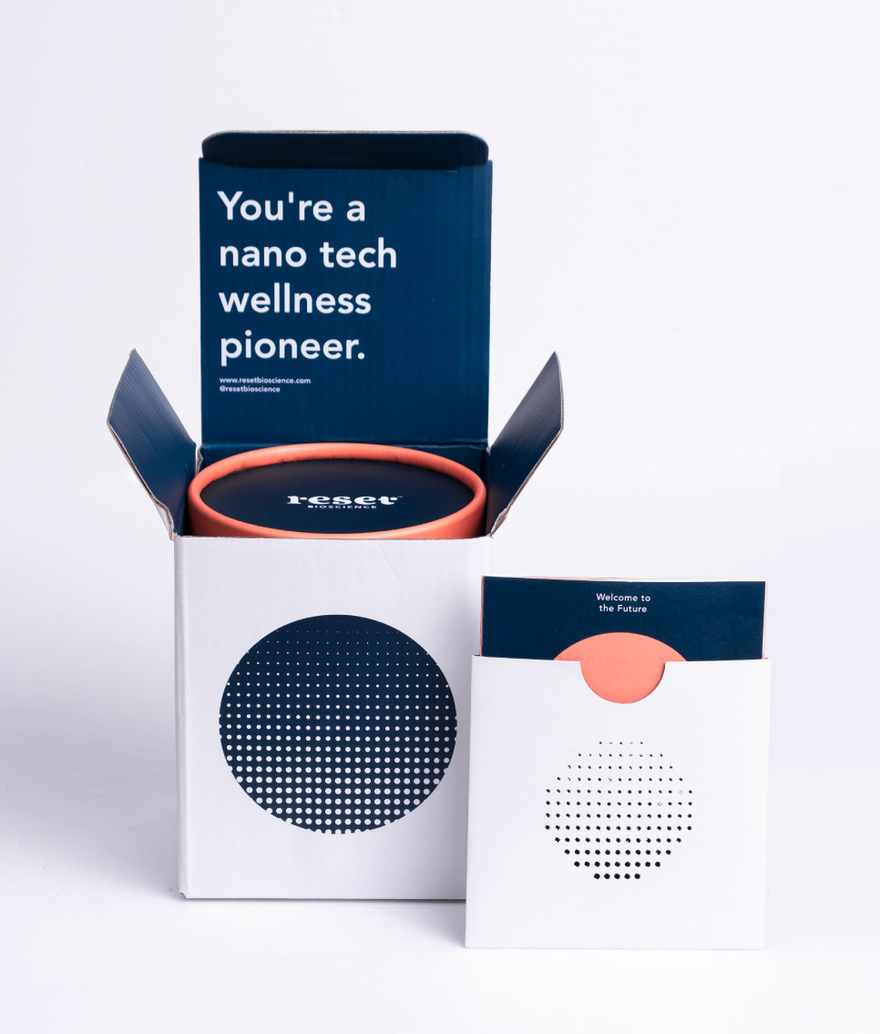
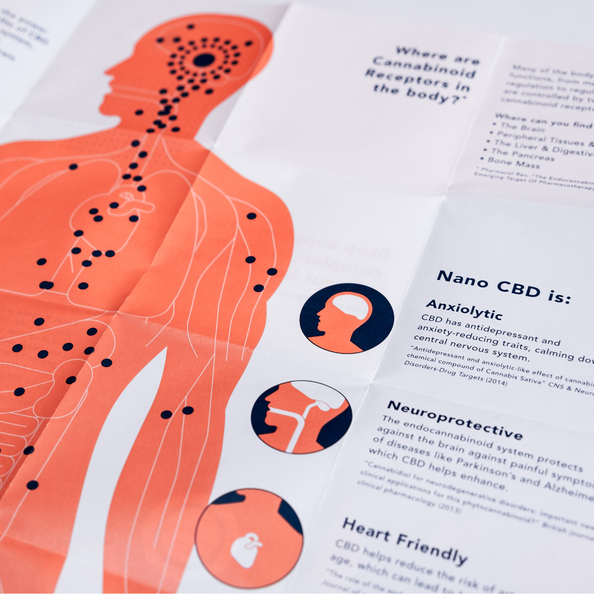
Each purchase of Reset Balance comes with leaflet that explains the functions of the human endocannabinoid system. After much research and working back and forth with CBD specialists and copyrighters, a neat and concise educational piece of literature took the form of a folded leaflet that can be found in every box of Reset Balance.

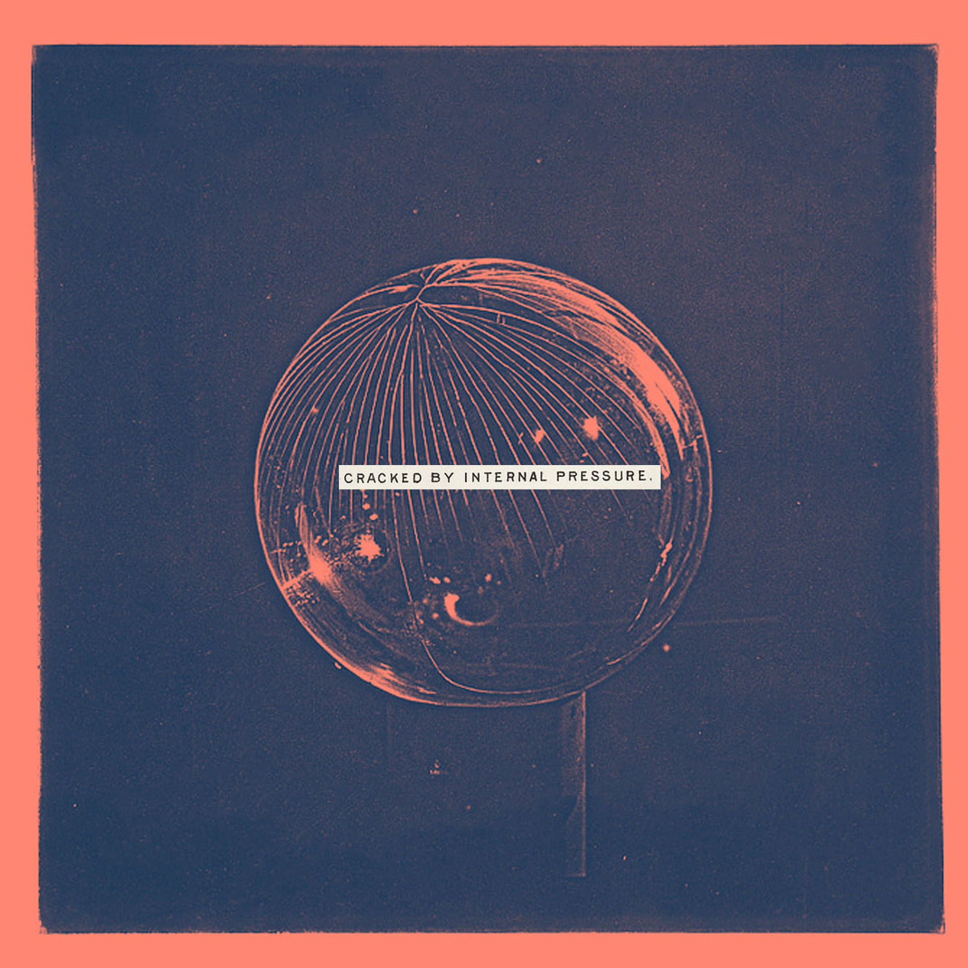
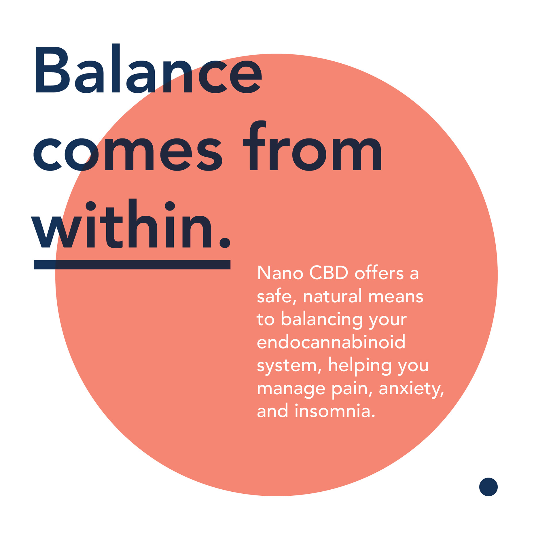
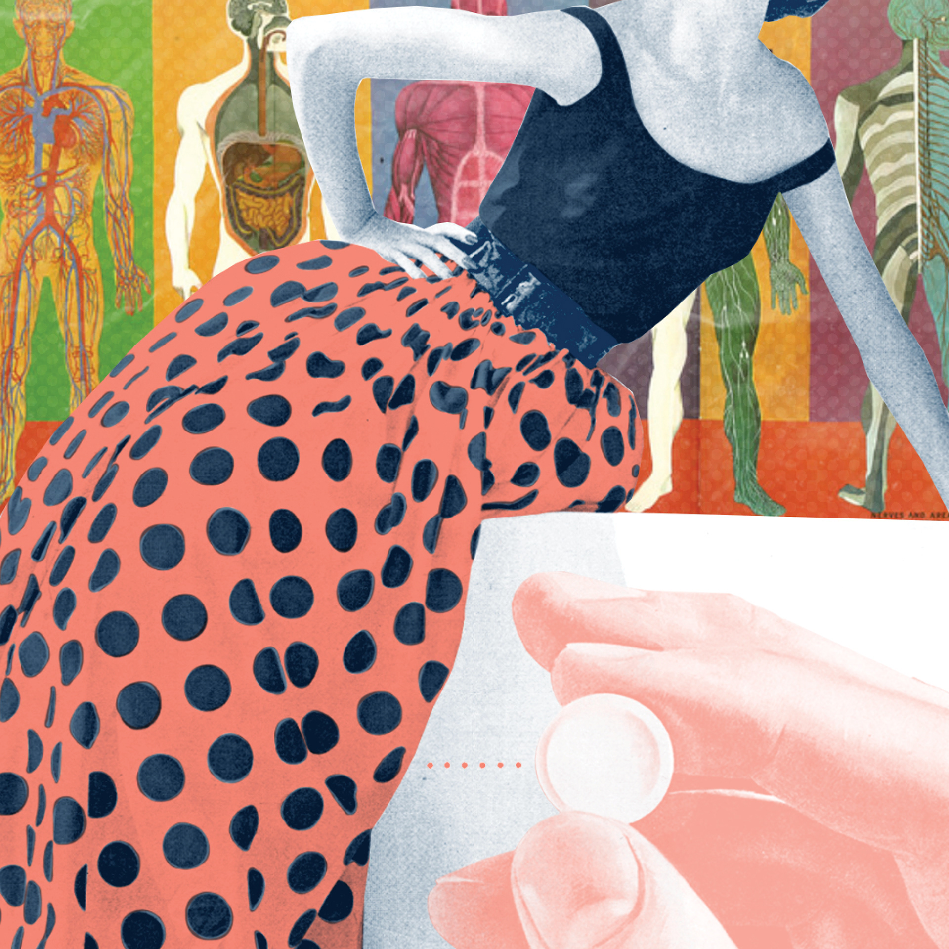
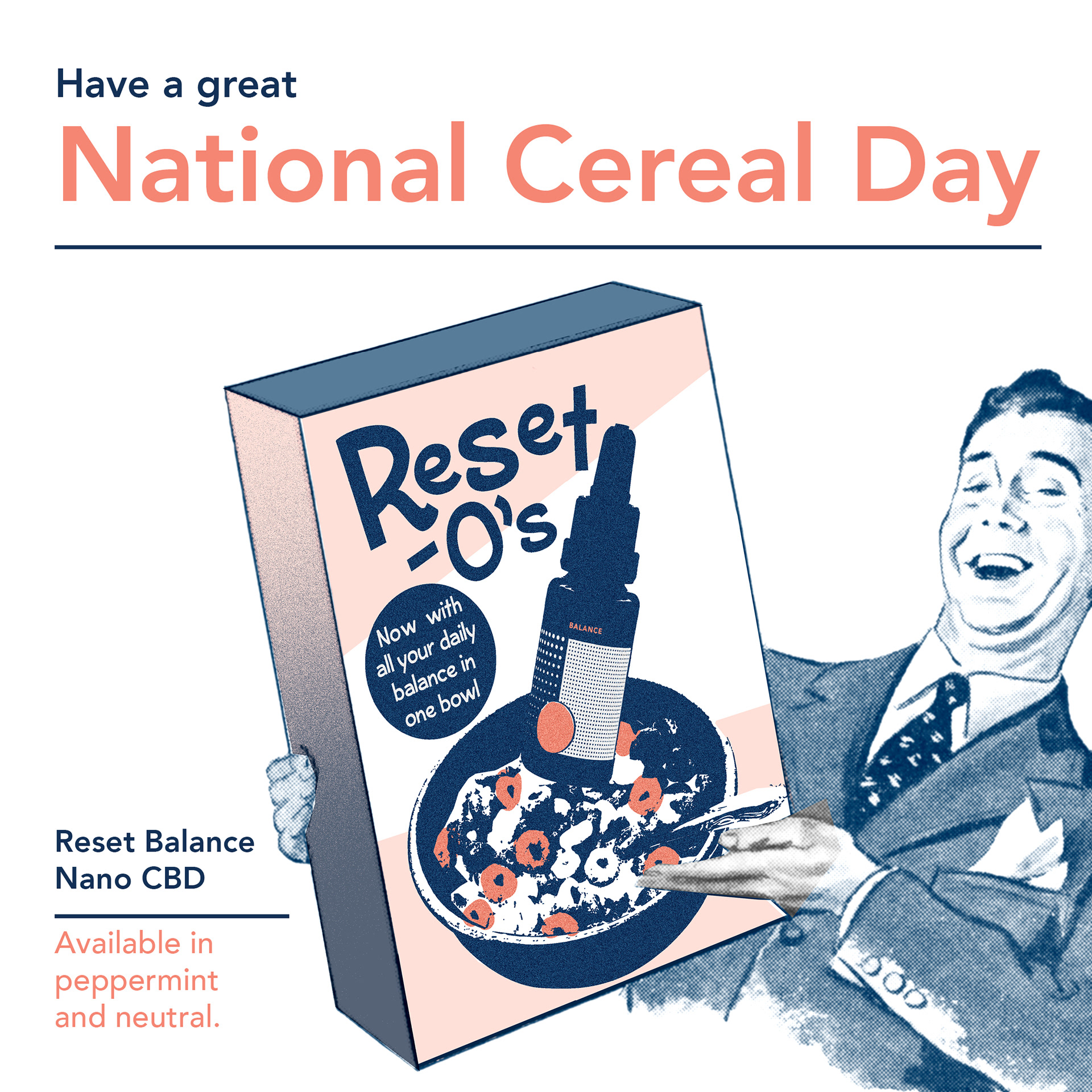
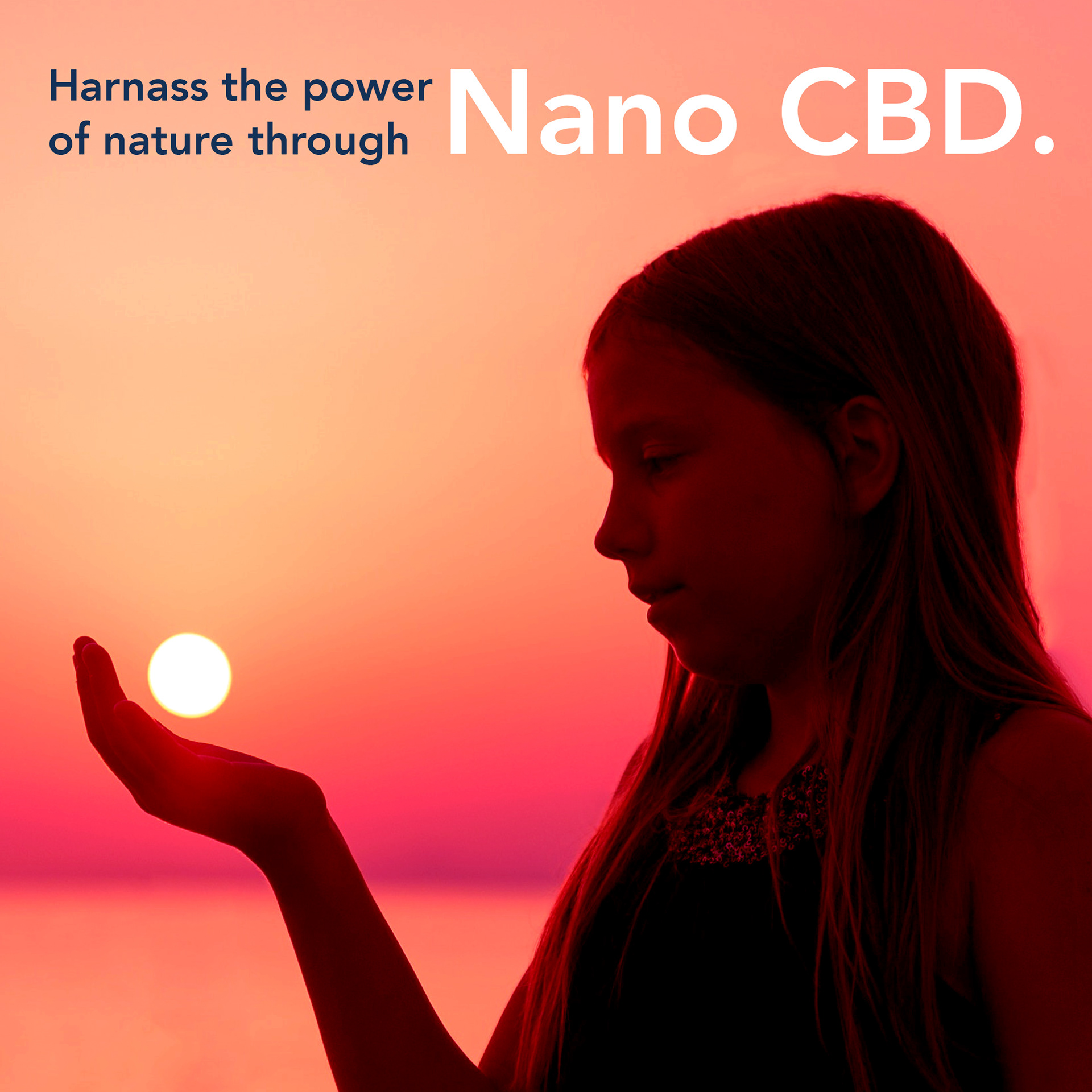
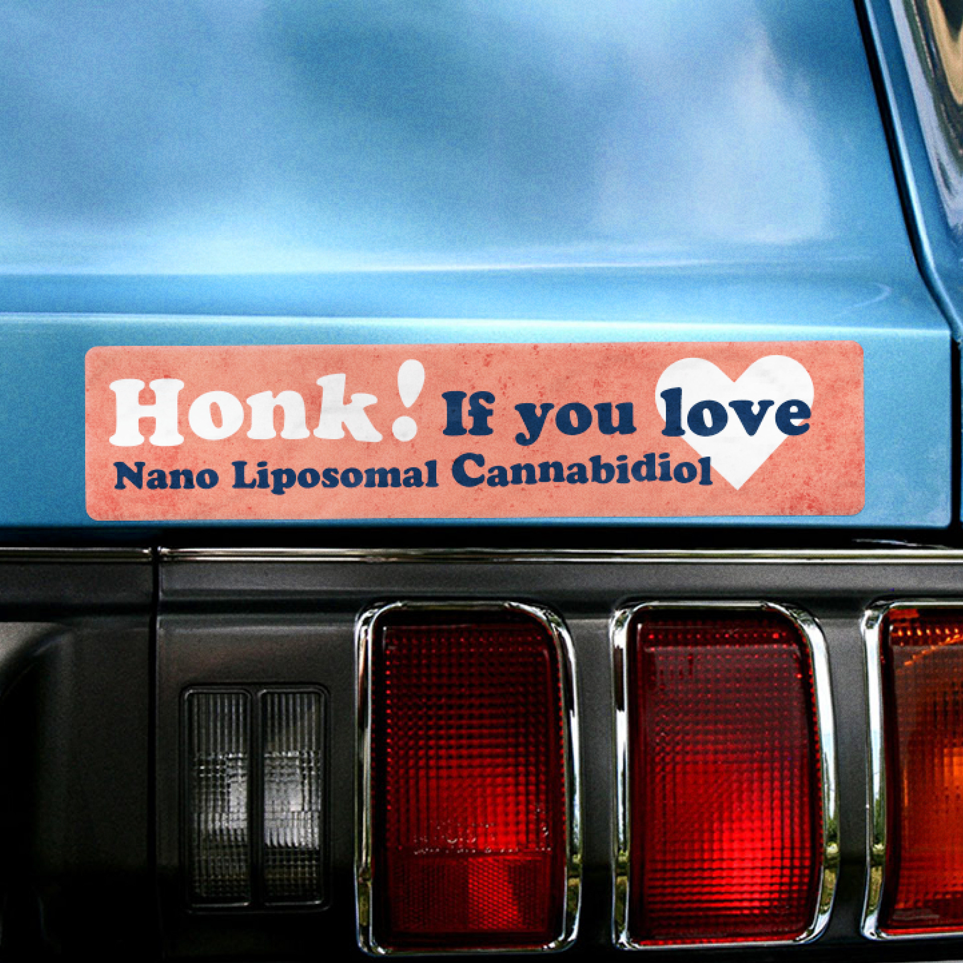
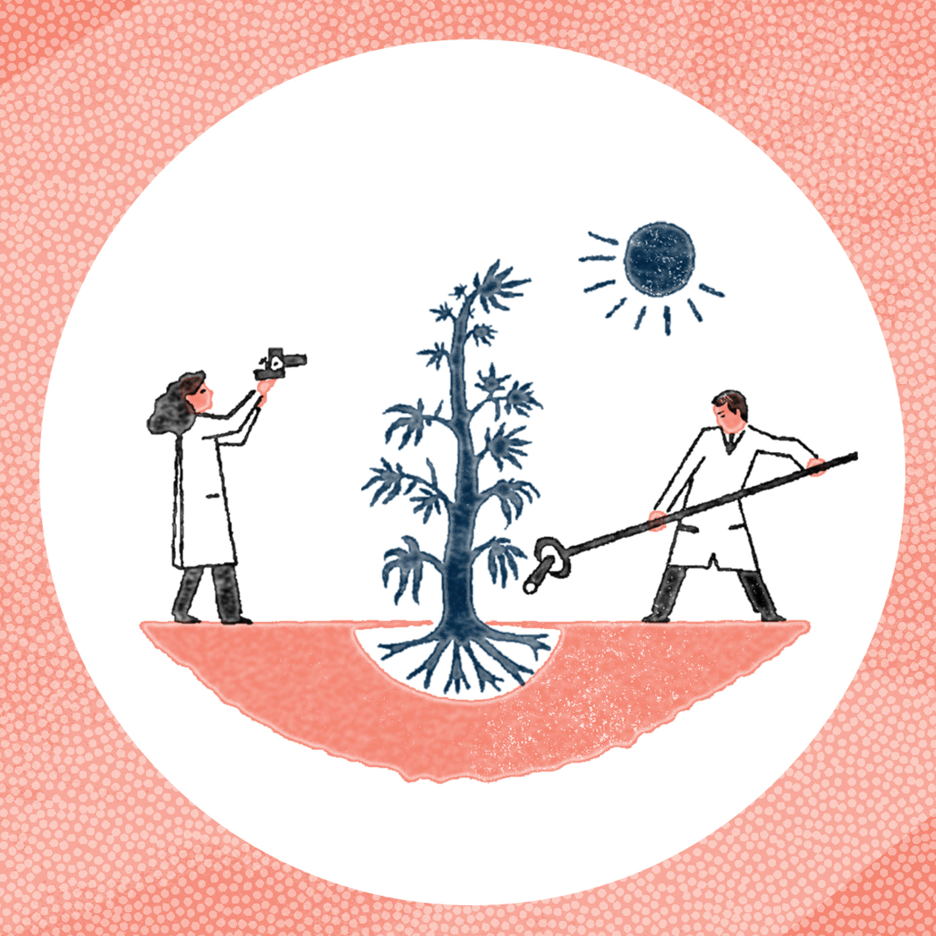
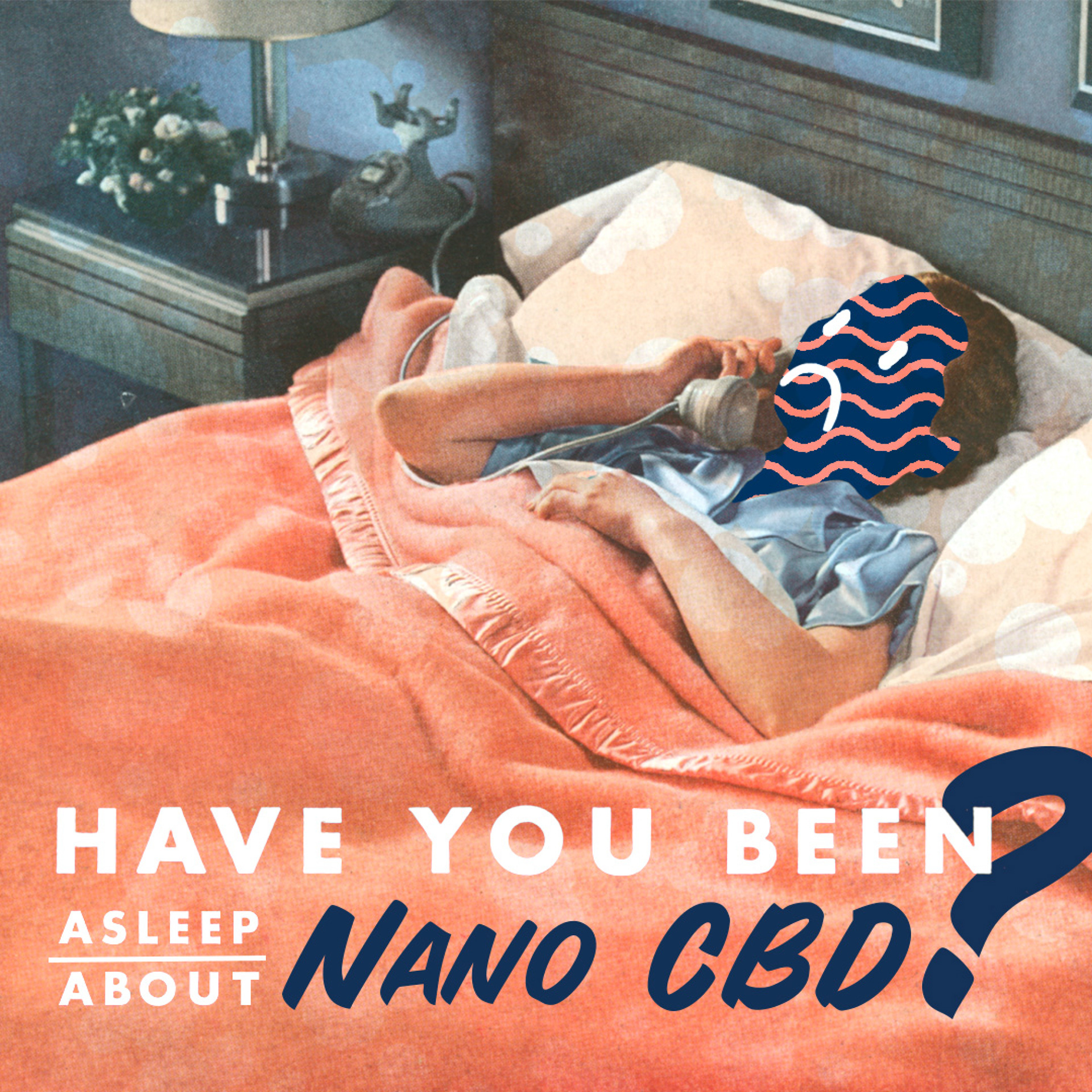
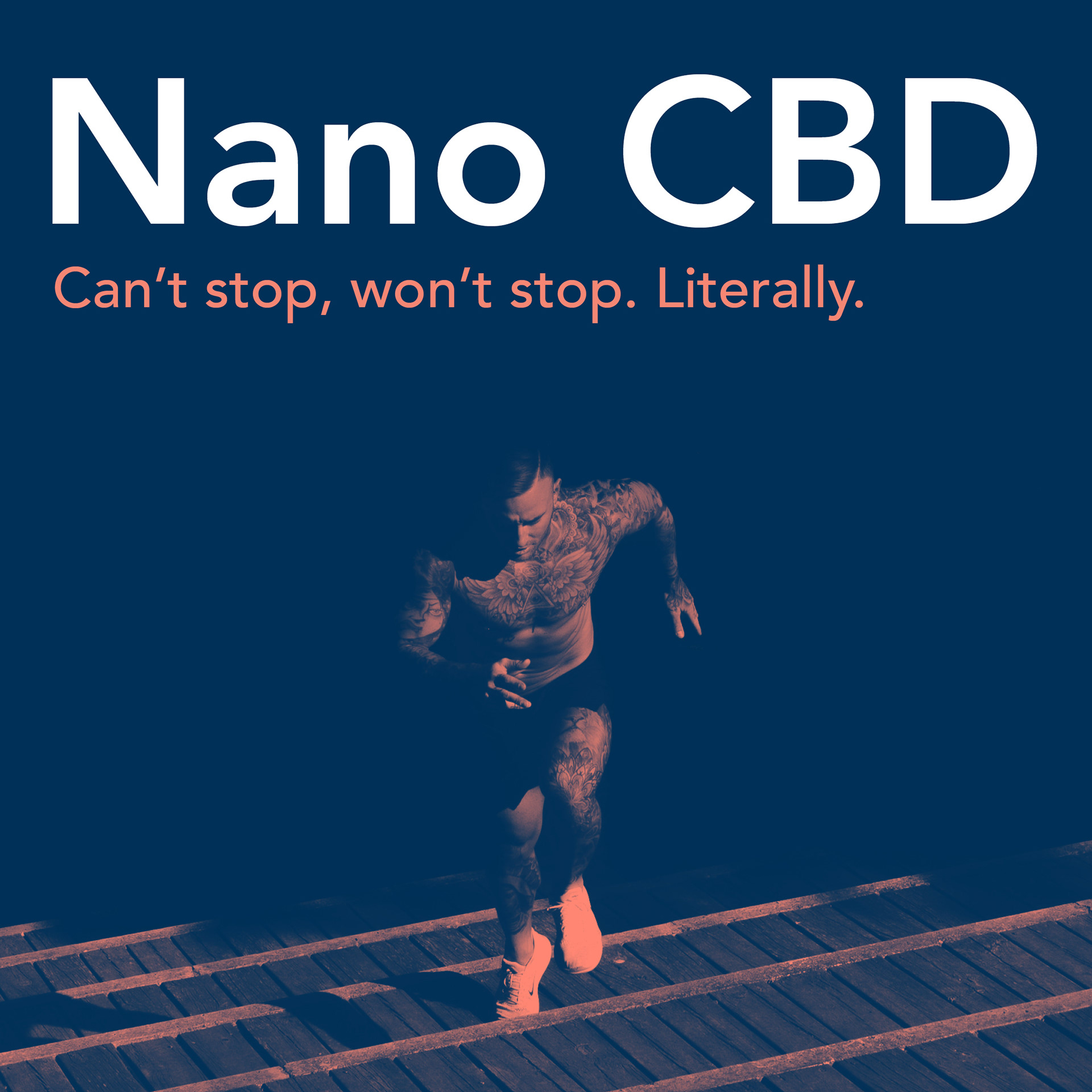
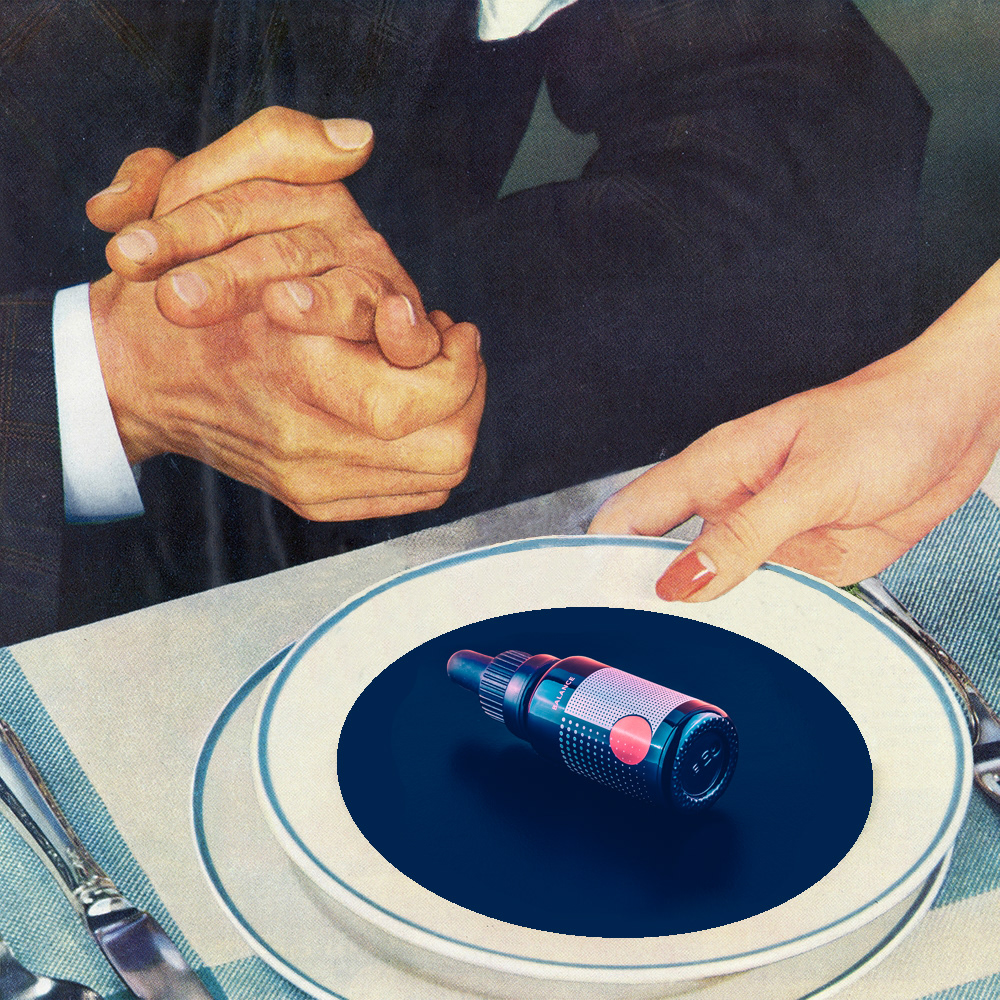
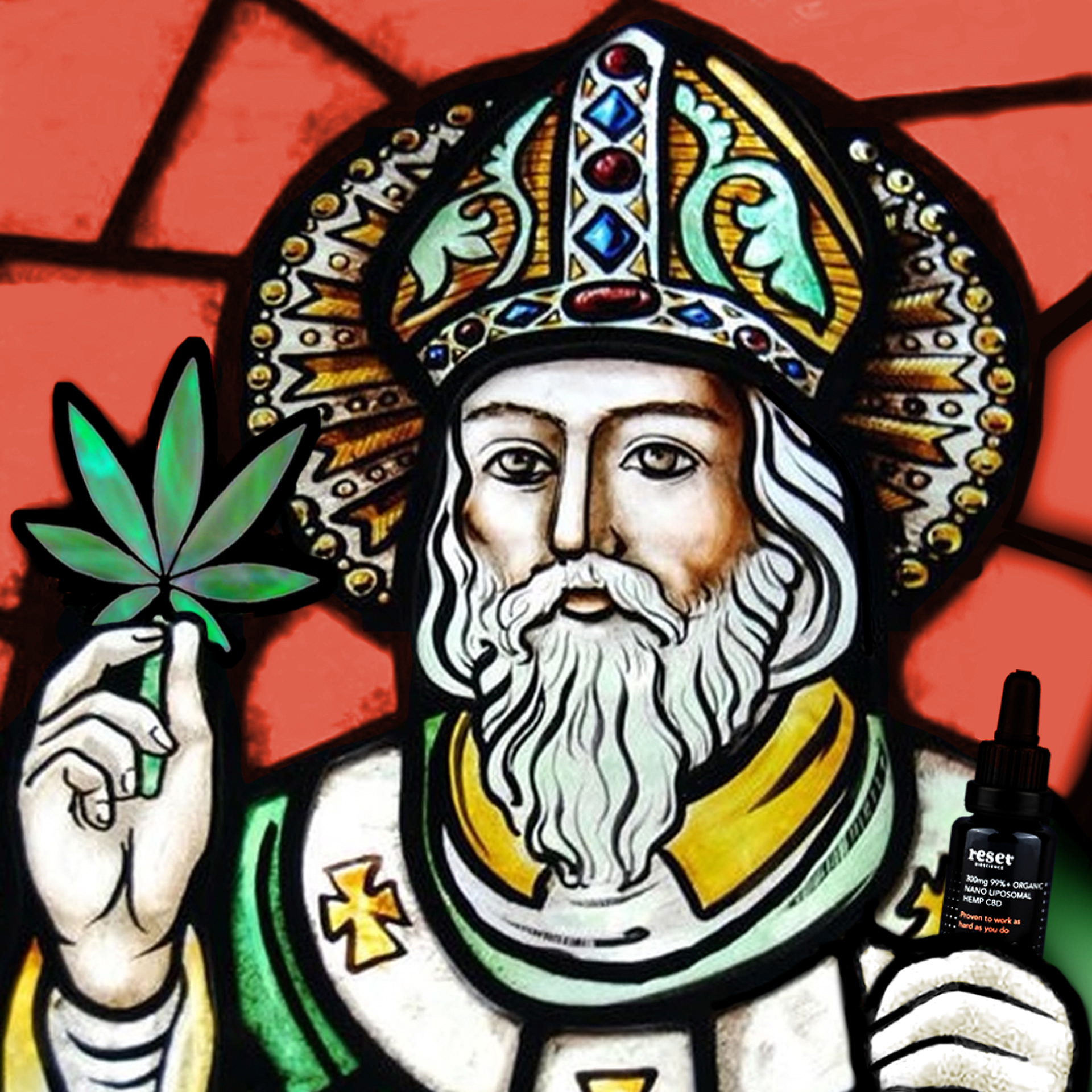
Online marketing materials for were need needed to be developed after the first stages of brand development. The goal here was to create inclusive materials that spoke to all demographics that may be positively impacted by the product. The simple, clean nature of the brand, combined with photography and clever, considerate copyrighting resulted in a spectrum of materials covering people old or young, male, female, pink or blue. This was a great opportunity to collaborate on developing the brand's message and DNA through copy creation and associated imagery.
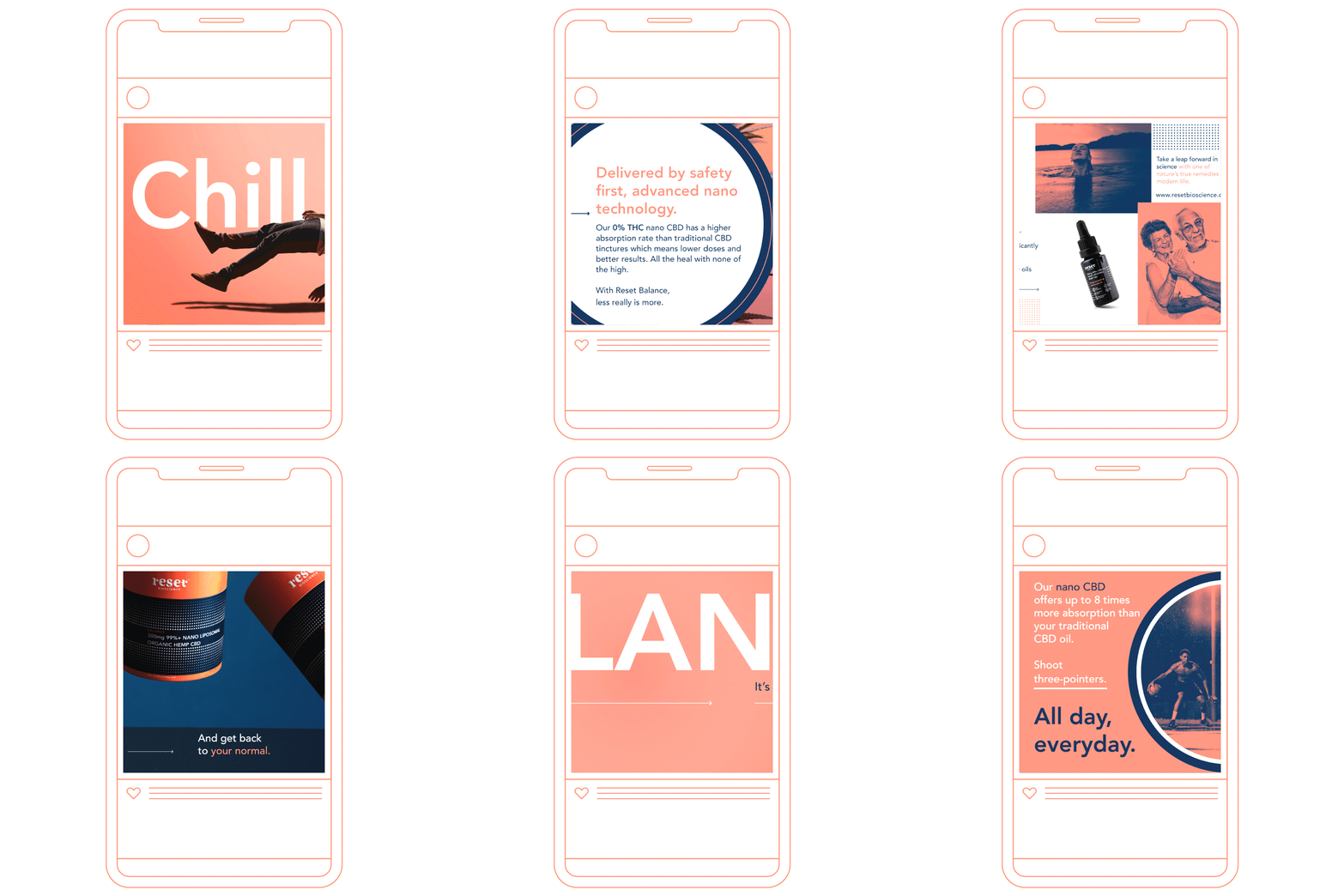
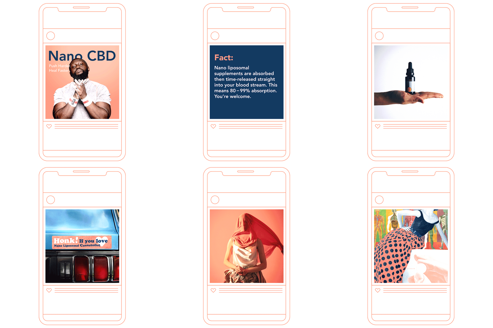
Below is a larger overview of a small portion of the materials made for social media purposes. Over 1000 items for social media that was implemented through Reset's channels by US based marketing company BIG CO.





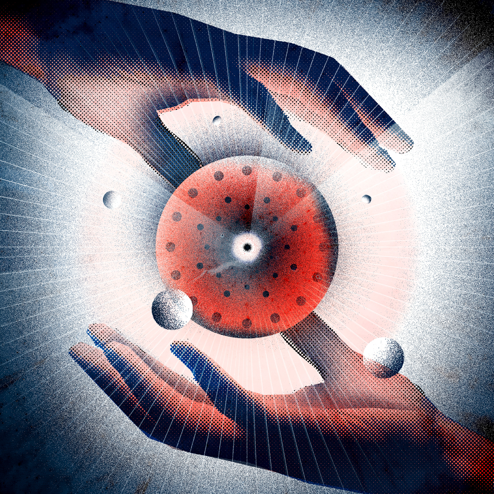


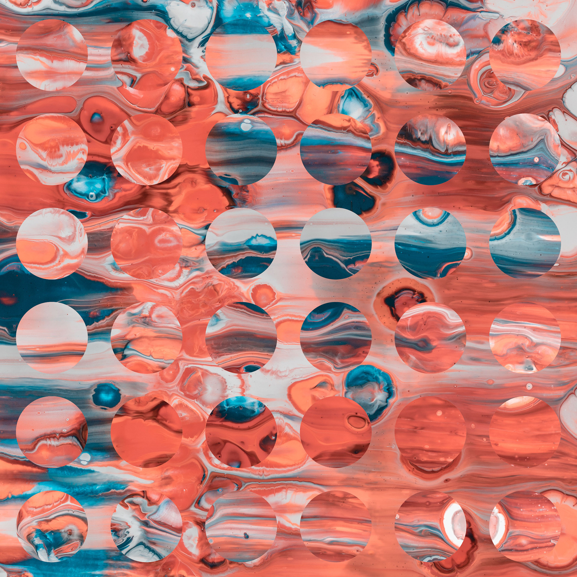
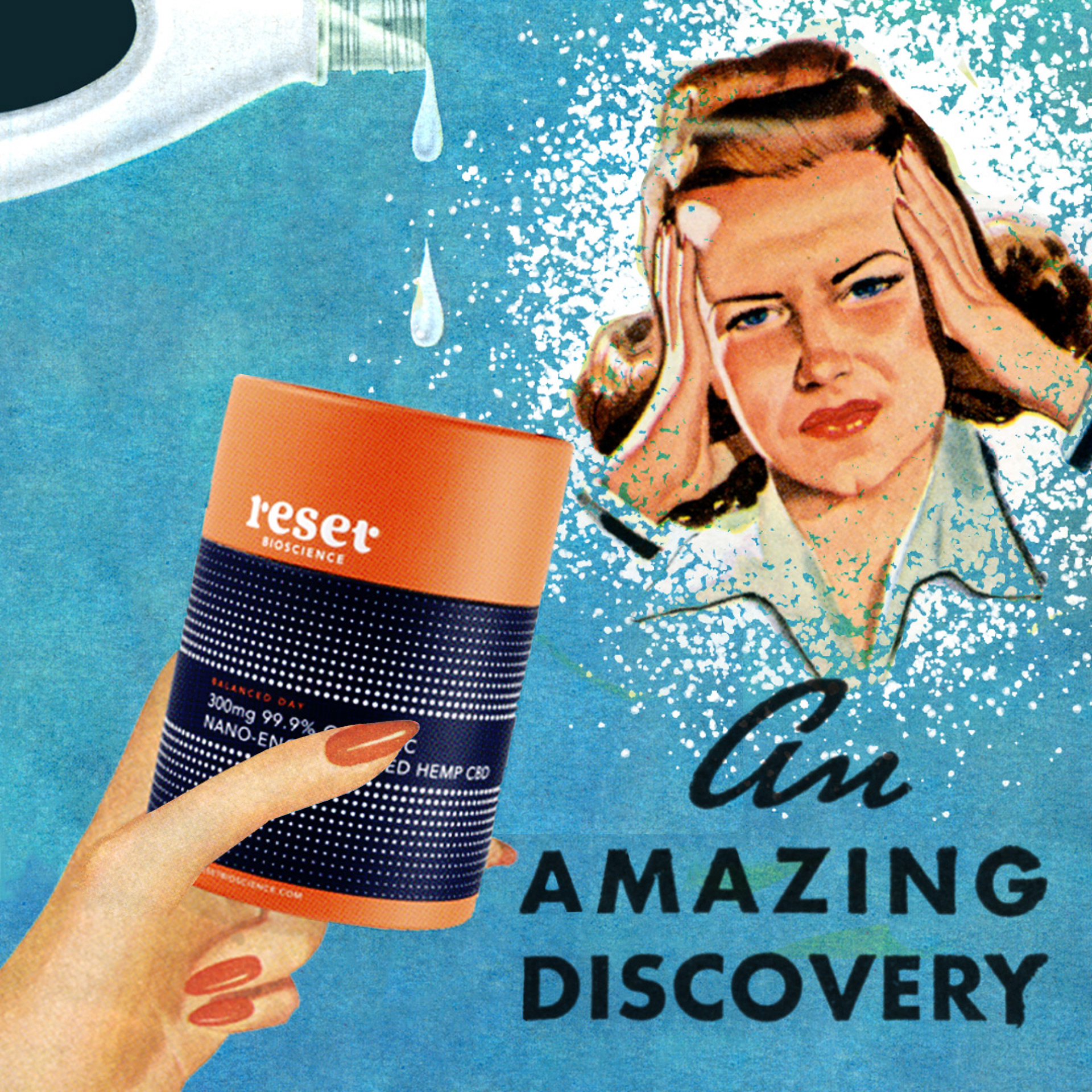
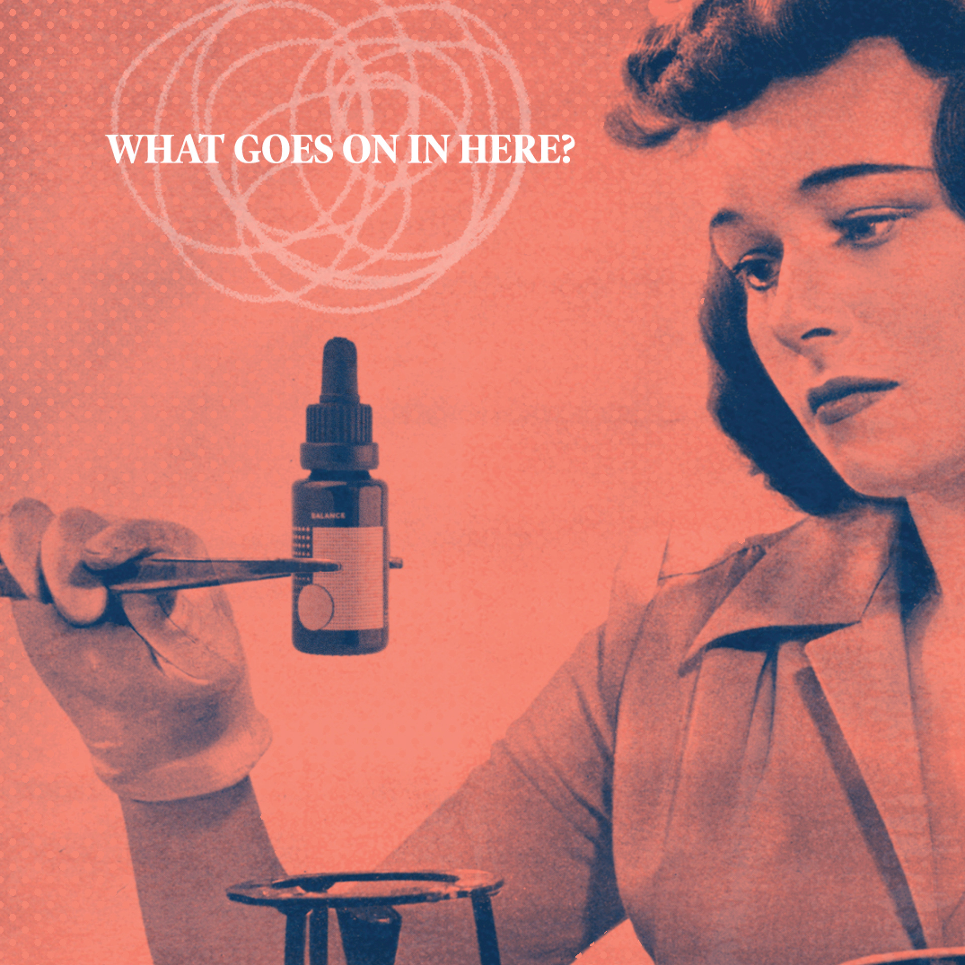



To finalise the project as a complete package, Well was in charge of directing the look and feel of the e-commerce website which also serves as point of education and a resource for the research Reset are currently undergoing with their nano-delivered CBD. A plethora of icons, animations, images and research based copy was developed by well to round off an online source of rich information that persuades several consumers everyday to make the switch to nanoliposomal CBD.
Thank you for looking!
Art Direction: Dustin Holmes
Graphic Design: Dustin Holmes, Jenna Tupin, Stephanie Handley, Yuen Shan Man
Animation: Dustin Holmes, Stephanie Handley, Jenna Turpin, Yuen Shan Man
Illustration: Dustin Holmes, Stephanie Handley, Jenna Turpin
Portfolio Photography and Post Production: Dustin Holmes (Unless stated)
Project Management: Dustin Holmes, Jenna Turpin
Packaging Production: Dustin Holmes, Jenna Turpin
Web design: Chris Janhle and Peter Reynolds
